Porosity & Inclusion Analysis redesign

Porosity & Inclusion Analysis redesign

I led the redesign of VGStudioMAX’s Porosity and Inclusion Analysis feature, a tool used across industries like aerospace and automotive to check the safety of critical parts.

Our focus was on transforming a complex, expert-only process into something that felt clear, guided, and approachable. The result was a faster, more intuitive experience that earned an iF Design Award 2025 for making advanced computer-tomography (CT) analysis easier for everyone, from beginners to experts, to learn and use.

I led the redesign of VGStudioMAX’s Porosity and Inclusion Analysis feature, a tool used across industries like aerospace and automotive to check the safety of critical parts. Our focus was on transforming a complex, expert-only process into something that felt clear, guided, and approachable. The result was a faster, more intuitive experience that earned an iF Design Award 2025 for making advanced computer-tomography (CT) analysis easier for everyone, from beginners to experts, to learn and use.

ROLE

Lead Designer

Lead Designer

AREAS

Research | UI/UX

Research

UI/UX

The challenge

The Porosity and Inclusion Analysis (PIA) feature in VGStudioMAX helps engineers find

and measure hidden flaws inside parts, like tiny holes or unwanted materials, by using

3D images created from industrial computer-tomography (CT) scans. This kind of analysis is essential in industries like aerospace, automotive, and medical manufacturing, where every part must be proven safe and reliable without being damaged in the process.


The problem wasn’t the capability of the tool, but how hard it was to use. New and less-experienced users, in particular, faced a steep learning curve.

The Porosity and Inclusion Analysis (PIA) feature in VGStudioMAX helps engineers find

and measure hidden flaws inside parts, like tiny holes or unwanted materials, by using

3D images created from industrial computer-tomography (CT) scans. This kind of analysis

is essential in industries like aerospace, automotive, and medical manufacturing, where

every part must be proven safe and reliable without being damaged in the process.


The problem wasn’t the capability of the tool, but how hard it was to use. New and less-experienced users, in particular, faced a steep learning curve.

The Porosity and Inclusion Analysis (PIA) feature in VGStudioMAX helps engineers find

and measure hidden flaws inside parts, like tiny holes or unwanted materials, by using

3D images created from industrial computer-tomography (CT) scans. This kind of analysis is essential in industries like aerospace, automotive, and medical manufacturing, where every part must be proven safe and reliable without being damaged in the process.


The problem wasn’t the capability of the tool, but how hard it was to use. New and less-experienced users, in particular, faced a steep learning curve.

Previous Porosity and Inclusion Analysis interface in VGStudioMAX.

Previous Porosity and Inclusion Analysis interface in VGStudioMAX.

The interface displayed dozens of settings at once, with little explanation of what they meant. Users often didn’t know which options were important, what the default values were doing, or how to set things up correctly to get the desired results. This made the tool hard to learn, prone to error, and unnecessarily slow.

The interface displayed dozens of settings at once, with little explanation of what they meant. Users often didn’t know which options were important, what the default values were doing,

or how to set things up correctly to get the desired results. This made the tool hard to learn, prone to error, and unnecessarily slow.

The goal

To address these challenges, the product team asked design for help to rethink the PIA workflow. The aim was to keep all its powerful capabilities while making it easier, clearer, and more approachable for every user.

To address these challenges, the product team asked design to rethink the PIA workflow.

The aim was to keep all its powerful capabilities while making it easier, clearer, and more approachable for every user.

To address these challenges, the product team asked design to rethink the PIA workflow.

The aim was to keep all its powerful capabilities while making it easier, clearer, and more approachable for every user.

The approach

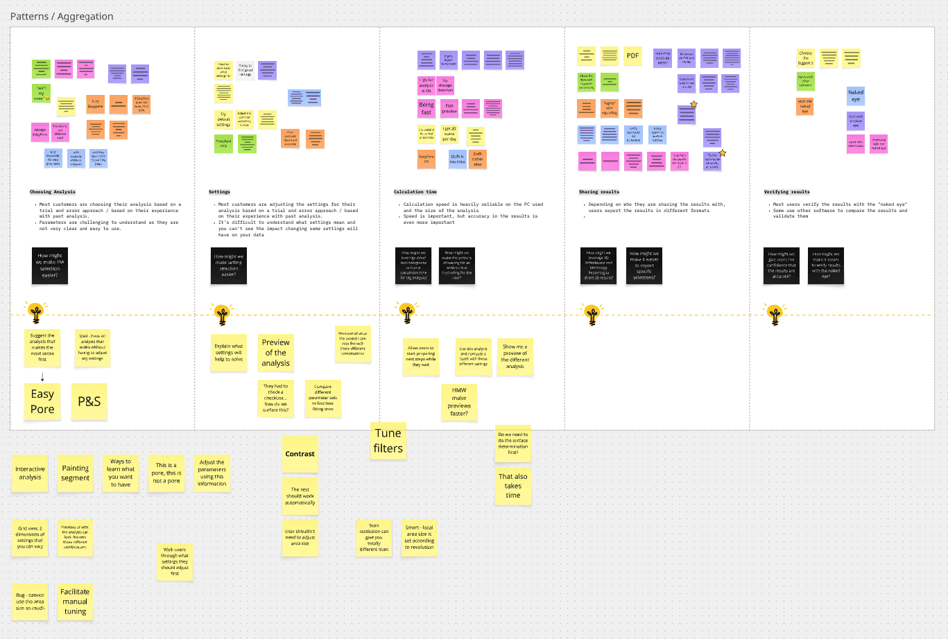
We spoke with both experienced users and new engineers to understand their struggles. While experts appreciated the precision, beginners often felt overwhelmed, which steered us to think about making the workflow more inclusive.

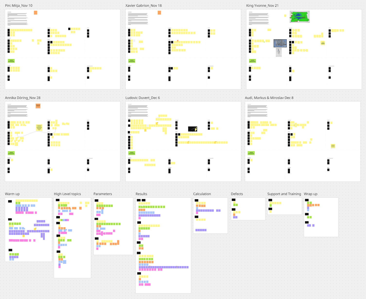
Starting with sticky notes and low-fidelity mockups in Miro, we moved through mid- and high-fidelity prototypes in Figma, validating them with users and internal testers before handing them off for development.

Early explorations of the information hierarchy and navigation of the new interface.

Early explorations of the information hierarchy and navigation of the new interface.

The outcome

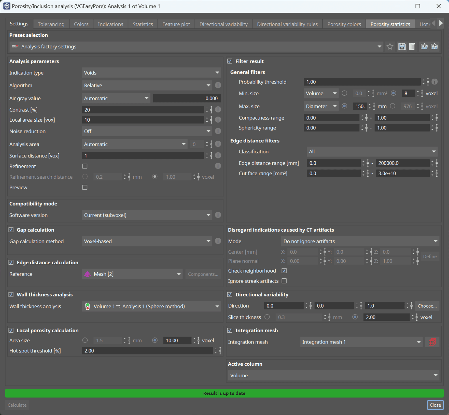
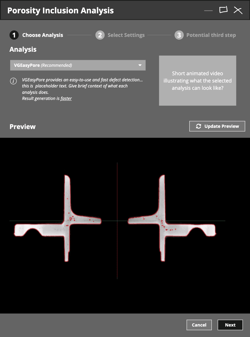
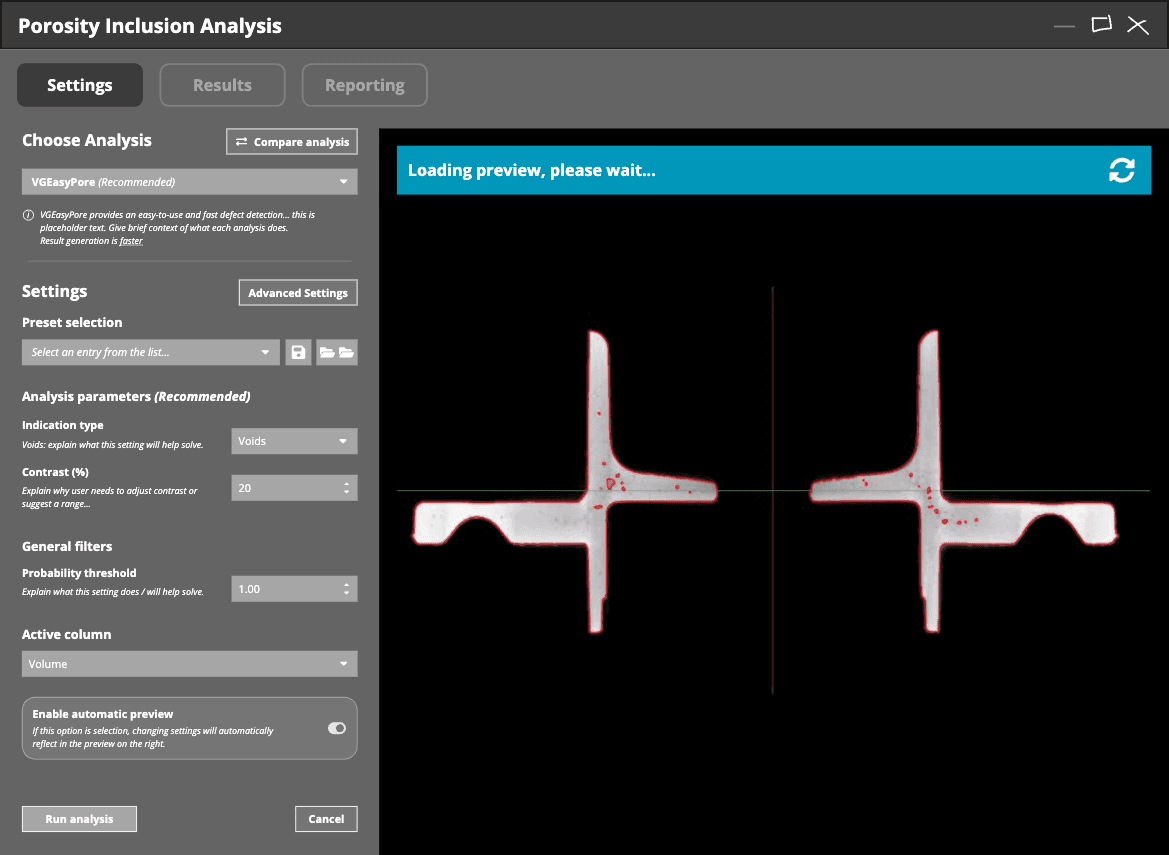
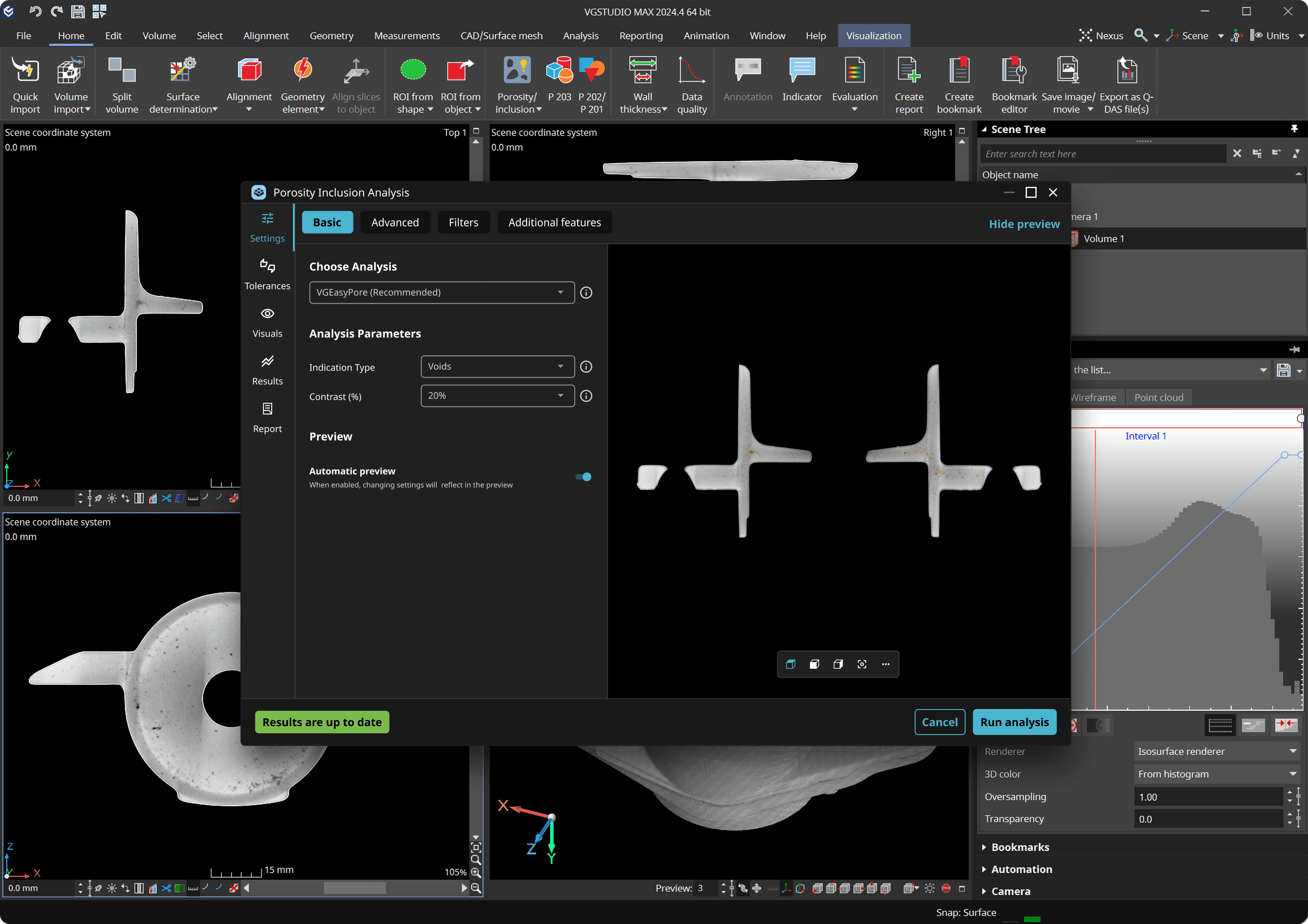
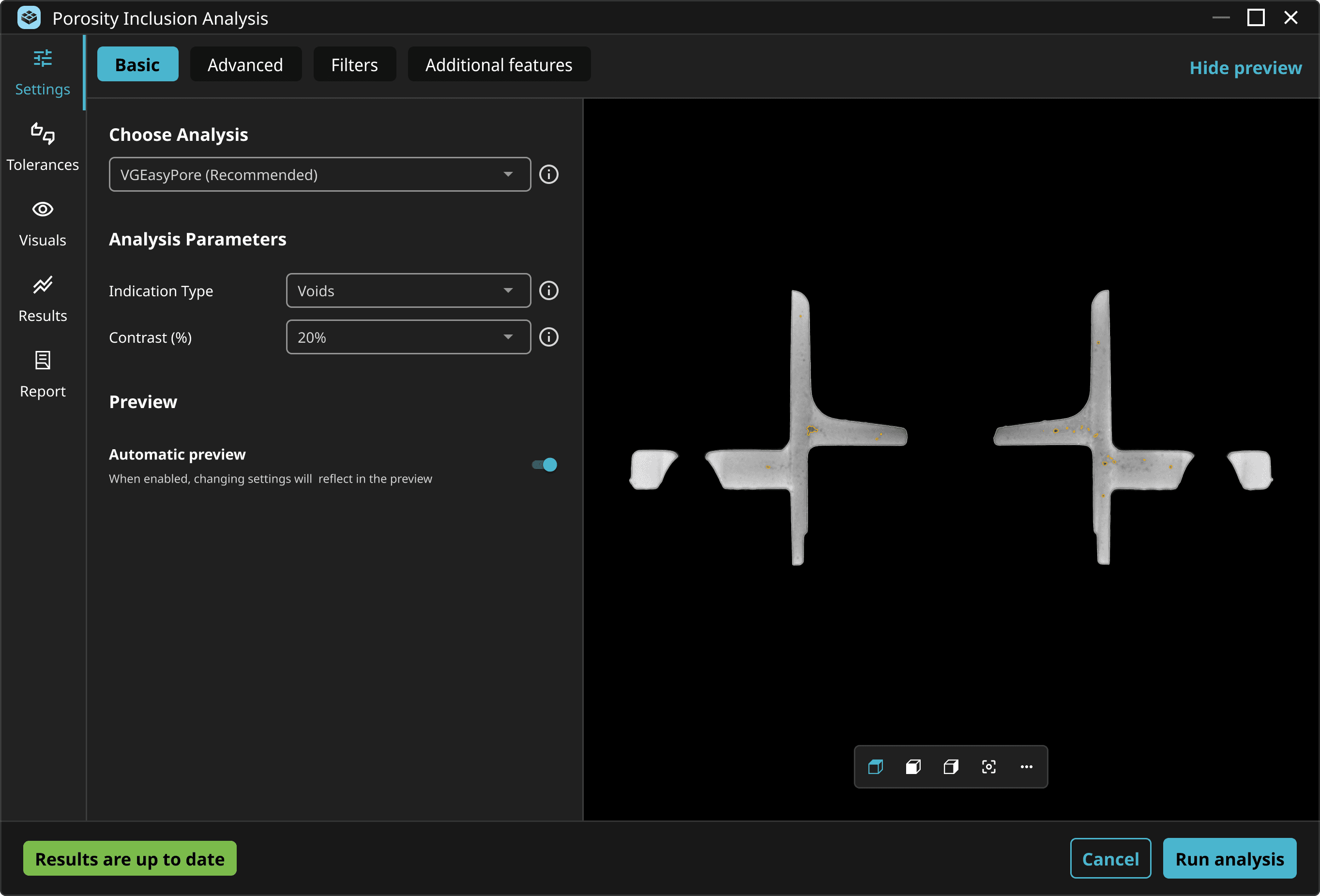
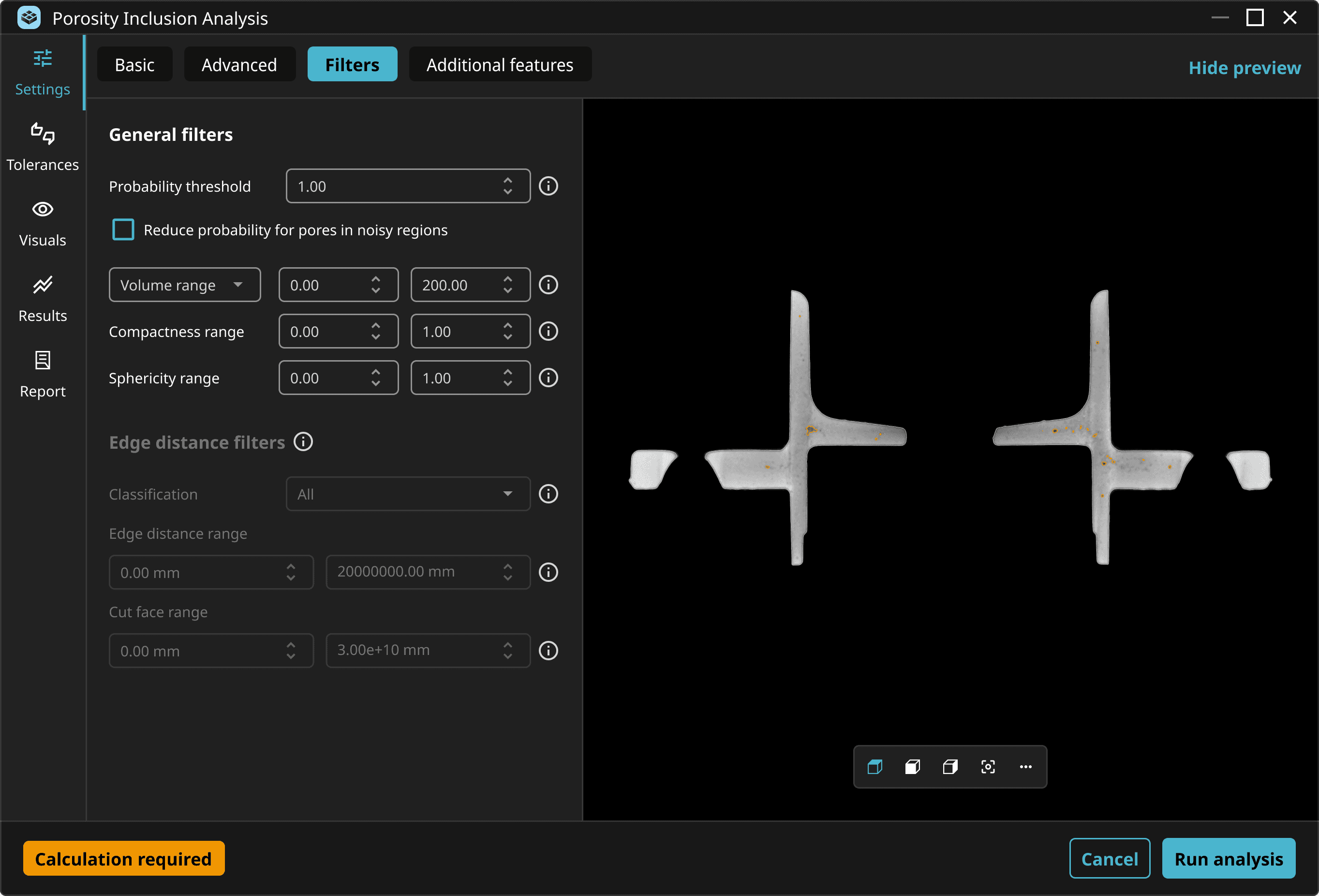
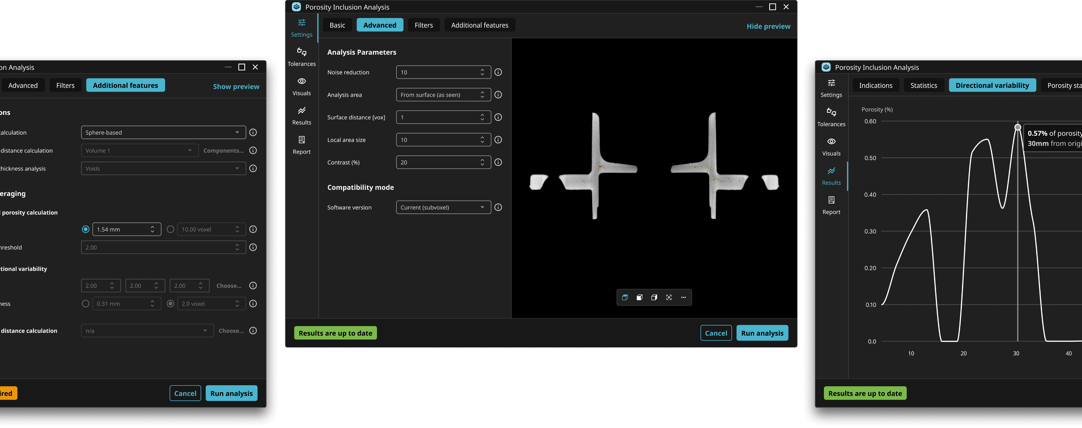
The new interface shows only the most important settings upfront, with advanced options organized into tabs. We introduced smart defaults that handle common analysis types and built contextual tooltips and visual feedback to help guide users through the workflow.

By refining the terminology, restructuring the layout, and adding clear visual cues, we transformed the feature from a guessing game into a guided experience.

The redesigned PIA lowered the barrier for new users while improving accuracy and efficiency for everyone. Beta feedback showed faster setup times, fewer errors, and greater confidence in results. By reducing cognitive load and aligning the workflow with users’ mental models, we helped engineering teams move from scan to insight more quickly, without sacrificing control or precision.


This work was honored with the iF Design Award 2025, recognizing its success in combining technical complexity with elegant usability.

Lessons learned

Designing for complexity doesn’t mean removing it, but organizing it. This project reinforced how important it is to find the right balance between power and usability, especially in technical domains. Teaming up with internal experts, power users and beginners allowed us to find that balance, and by focusing on progressive disclosure, smart defaults, and contextual guidance, we created a more inclusive experience that empowers a broader range of users to make better, faster decisions using advanced technology.

MARIANA. 2026

From Portugal, with love.

Designed in Figma, brought to life in Framer.

MARIANA. 2026

From Portugal, with love.

Designed in Figma, brought to life in Framer.

MARIANA. 2026

From Portugal, with love.

Designed in Figma, brought to life in Framer.