The challenge
From a user’s point of view, the experience felt fragmented and hard to follow. It was often unclear where they were in the process, how different tasks related to each other, or what the next step should be. As the platform continued to grow, this lack of cohesion became a major barrier to usability, adoption, and long-term scalability.
The goal
The goal was not simply to merge applications, but to design one clear, connected experience. We wanted FUSION to feel intuitive and predictable, helping users move smoothly through their work while maintaining context and orientation.
At the same time, the solution needed to support different roles, workflows, and levels of expertise without overwhelming users or oversimplifying a complex domain.
The approach
We started by stepping back from individual features and looking at the full end-to-end journey. Through user research, workshops, and close collaboration with product and engineering, we mapped how people actually work across the metrology process and identified key pain points, overlaps, and shared concepts.
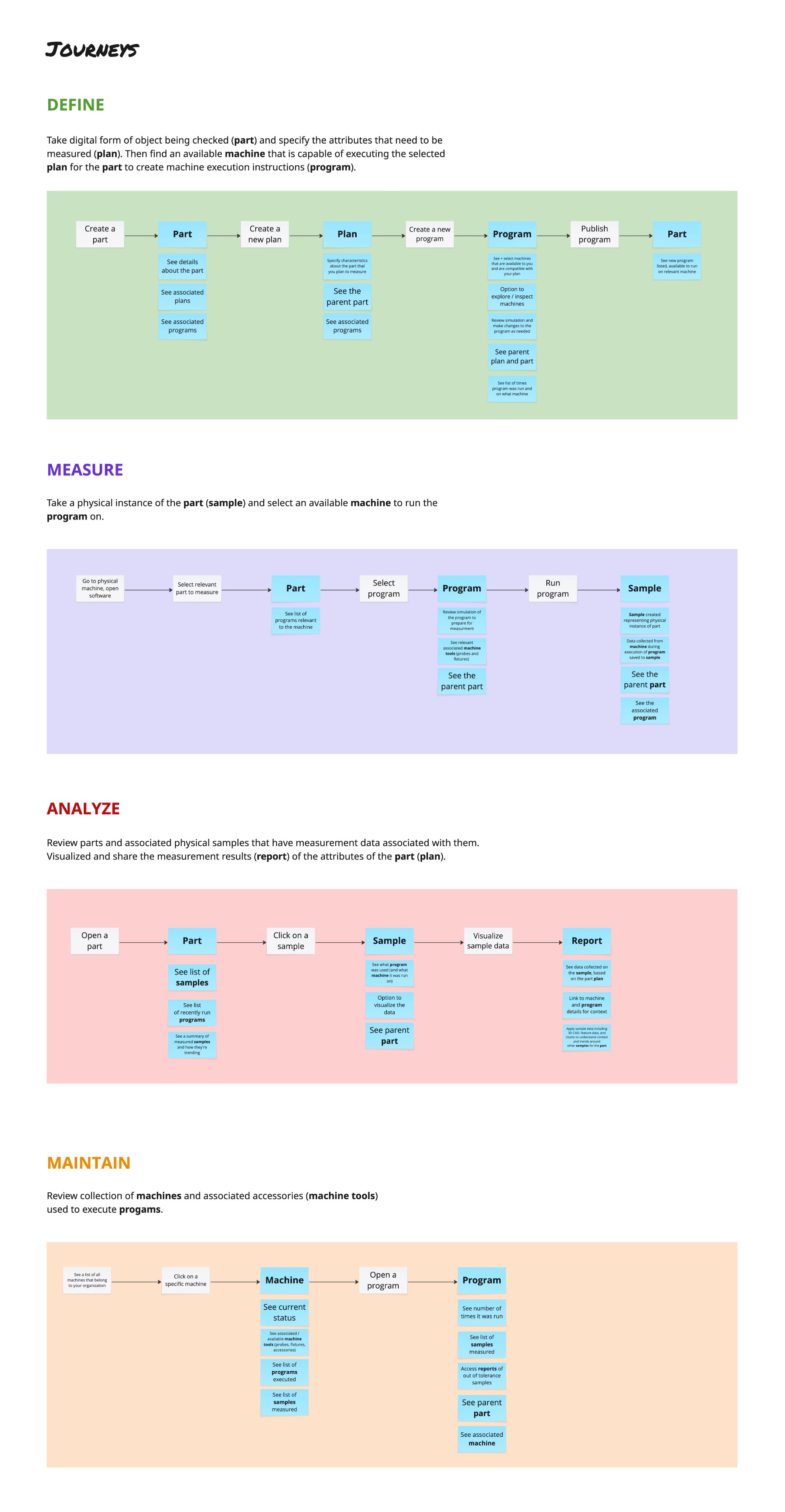
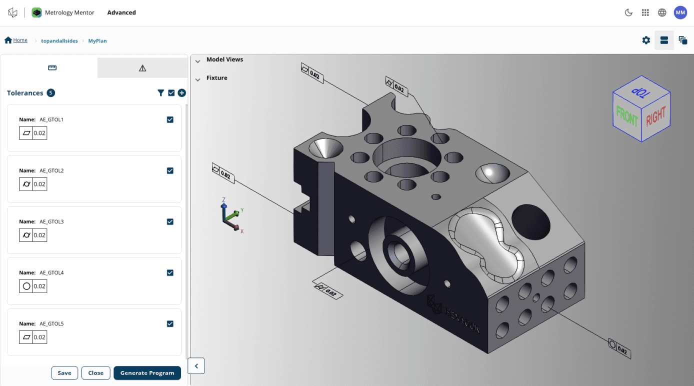
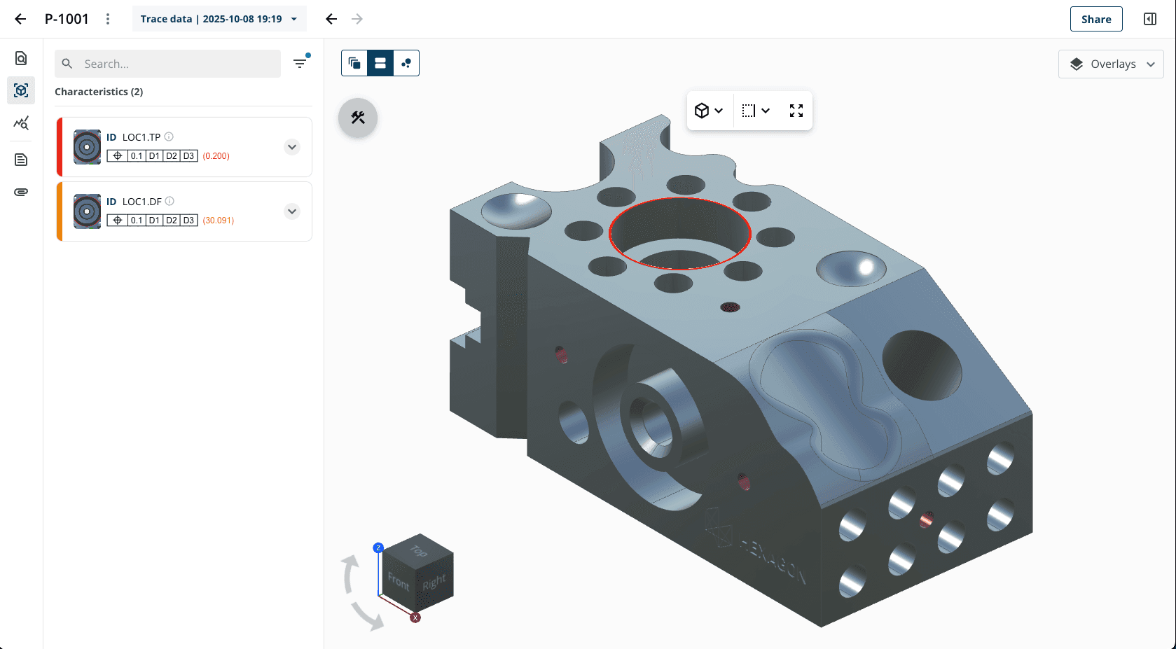
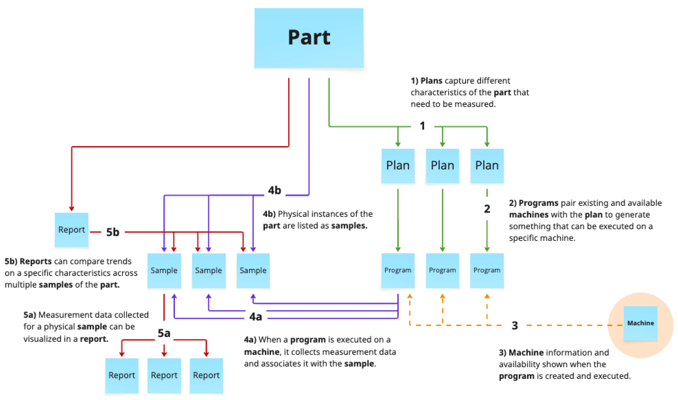
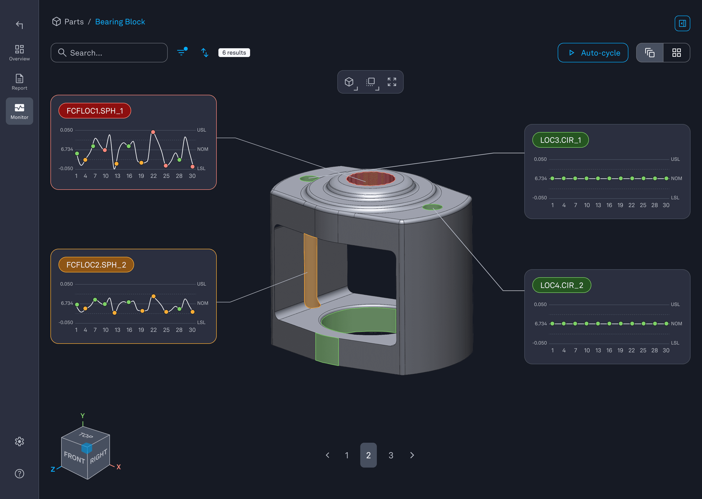
This led to a shift from app-based thinking to object- and journey-based design. Instead of organizing the experience around tools, we structured it around core entities such as parts, programs, samples, machines, and reports. These shared objects became the backbone of the system, allowing users to stay oriented as they moved between tasks.
From there, we explored what “one app” could look and feel like: a unified navigation model, consistent interaction patterns, shared language, and smoother transitions between stages of work. Concepts were explored through prototypes and design reviews and aligned closely with stakeholders to ensure feasibility and long-term direction.
The outcome
The redesign transformed FUSION into a single, intelligent system where users can stay immersed in their work without constantly switching tools or losing context. Instead of navigating disconnected applications, users start from a single entrypoint and move through a continuous experience that reflects how their work naturally flows, from
planning, to execution, to analysis.

By centering the experience around shared objects and journeys, the system surfaces the information users need at the right moment, with the right context. Data is no longer scattered or hidden behind separate tools; it is connected, traceable, and easier to understand. This allows users to focus their attention on what truly matters, rather than spending time searching for information or reconstructing the workflow in their heads.
The unified experience also creates a stronger sense of orientation and confidence. Users always know where they are, what they are working on, and how different steps relate to each other. This clarity enables better decisions to be made faster, while still supporting the complexity and flexibility required by different roles and workflows.
Beyond immediate usability improvements, this work established a scalable foundation for the platform’s future. FUSION is no longer a collection of features, but a coherent system designed to grow, aligning teams internally and setting a clear direction for how new capabilities can be added without breaking the experience.
Lessons learned
Designing at a system level means resisting the urge to jump straight into screens and features. This project reinforced the importance of understanding the full journey first, then designing structures that can support growth over time. By focusing on how users think about their work, rather than how systems are built, we created a more coherent and future-proof experience.
