The challenge
Traditionally, inspection reports were static PDFs shared by email or stored in disconnected systems. Teams often dealt with outdated data, inconsistent formats, and slow communication between quality engineers, production staff, and suppliers.
Even though reporting is a critical step in the quality process, it was often treated as a final output instead of part of the ongoing workflow. Without real-time visibility and collaboration tools, teams couldn’t react quickly to quality issues. This led to delays, misalignment across departments, and extra work just to keep reports up to date. Users needed something simpler: trustworthy, visual data that everyone could access and use.
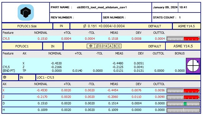
Traditional PC-DMIS pdf report.
The goal
We wanted to transform inspection reporting from a passive, static document into a living, interactive tool. The goal was to design an experience that made inspection data accessible, visual, and easy to share with colleagues and suppliers, helping teams make faster (and better) decisions and stay aligned, no matter their role or location.
The approach
We started by mapping the full reporting workflow and speaking with users across different roles to learn about their frustrations. The main issues were clear: too many disconnected tools, a lack of context in the reports, and communication that was always one step behind.
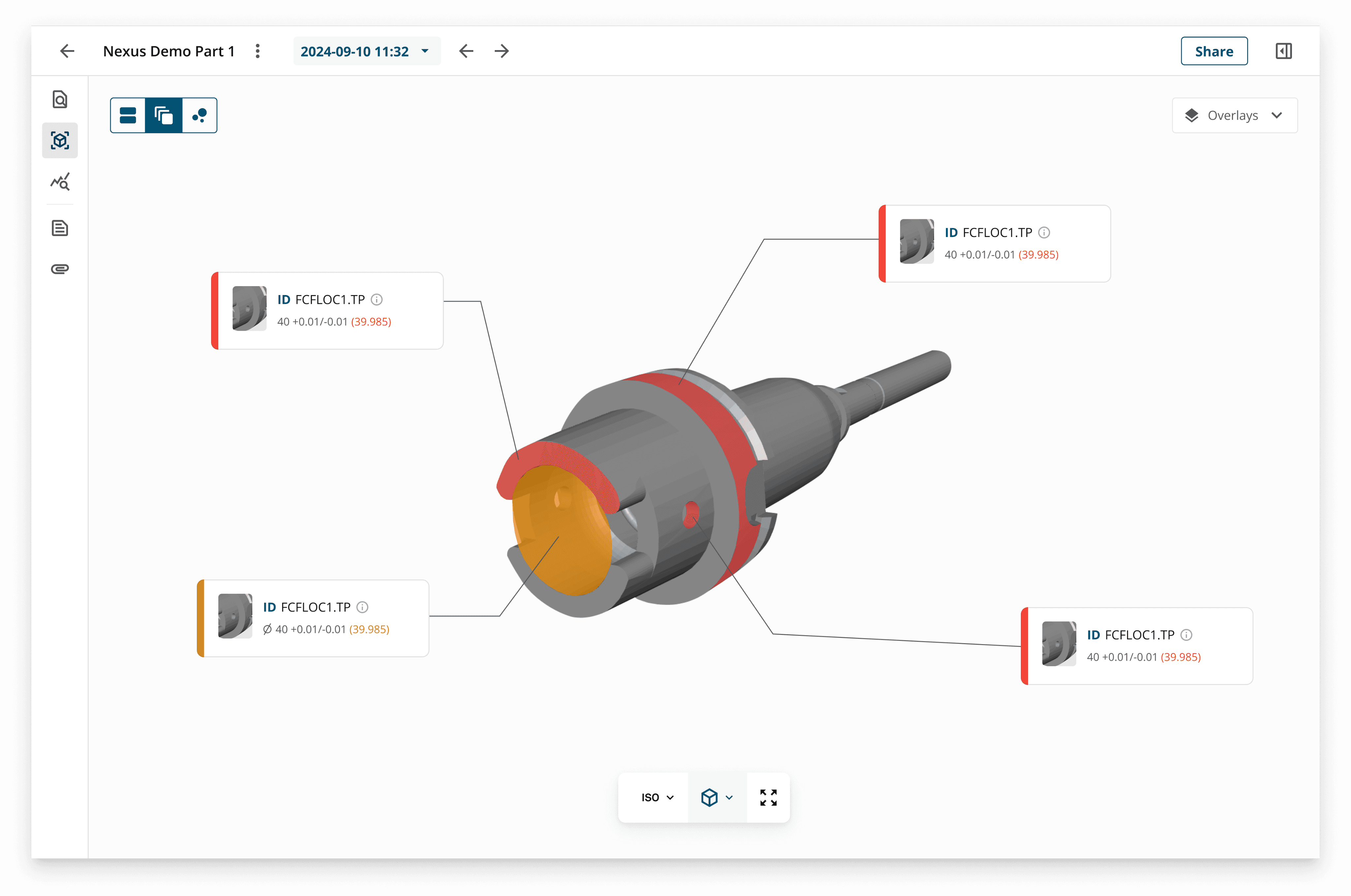
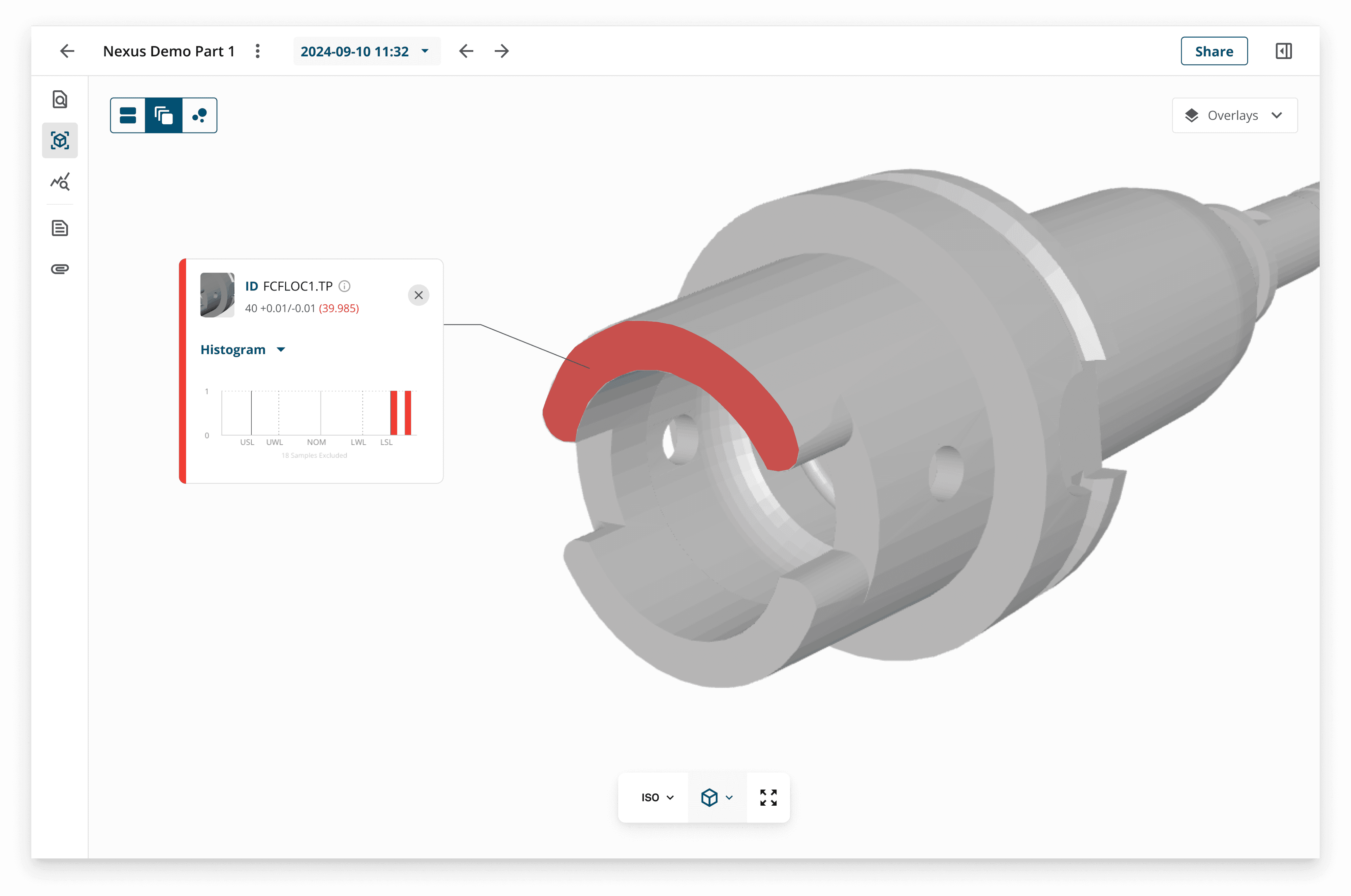
With these insights, we redesigned the experience within a new cloud platform. Instead of long tables and static exports, users now see interactive dashboards with CAD-linked data that highlight where issues occur.
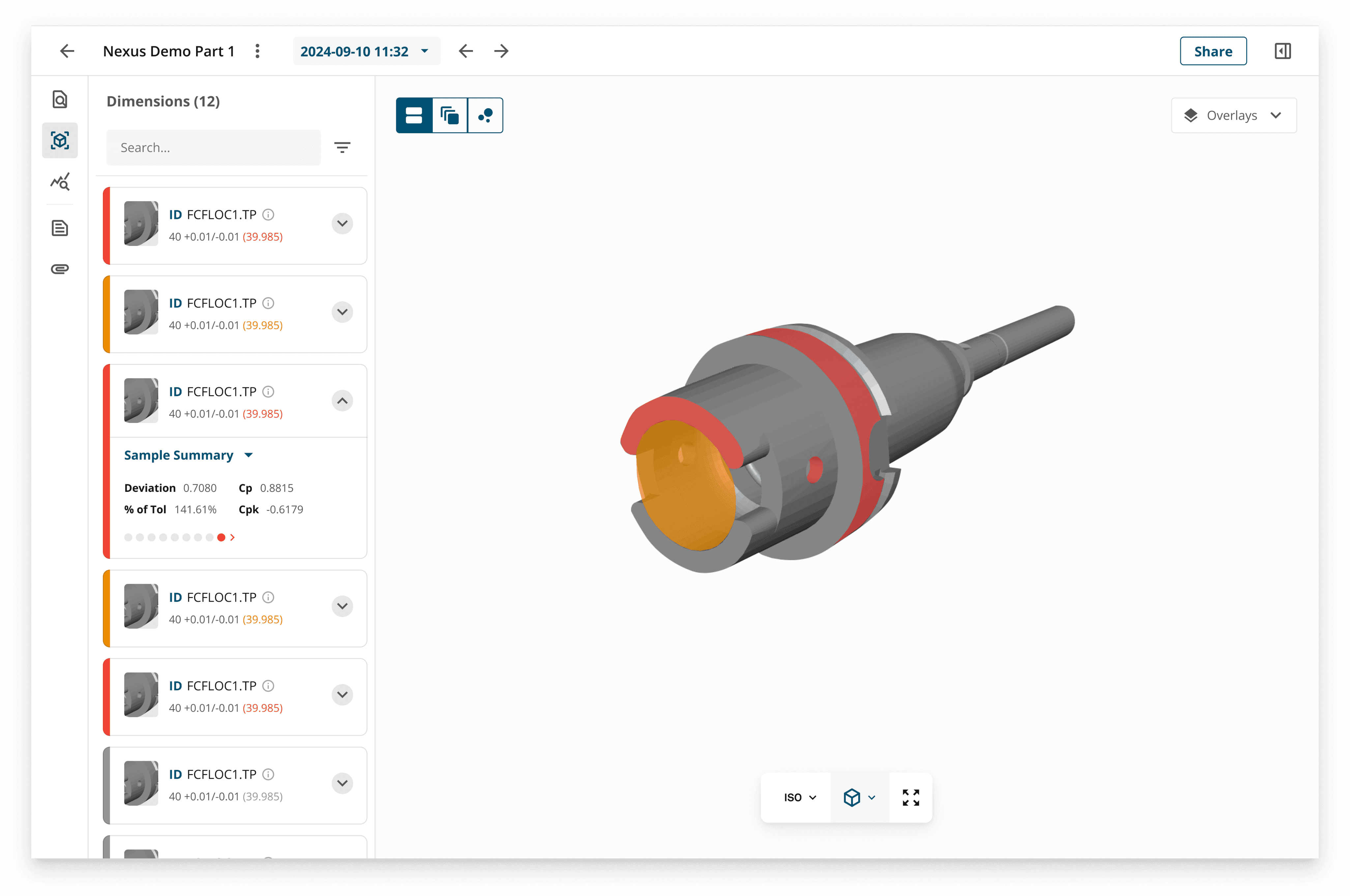
The CAD view shows how certain elements of the measured part deviate from the defined tolerance.
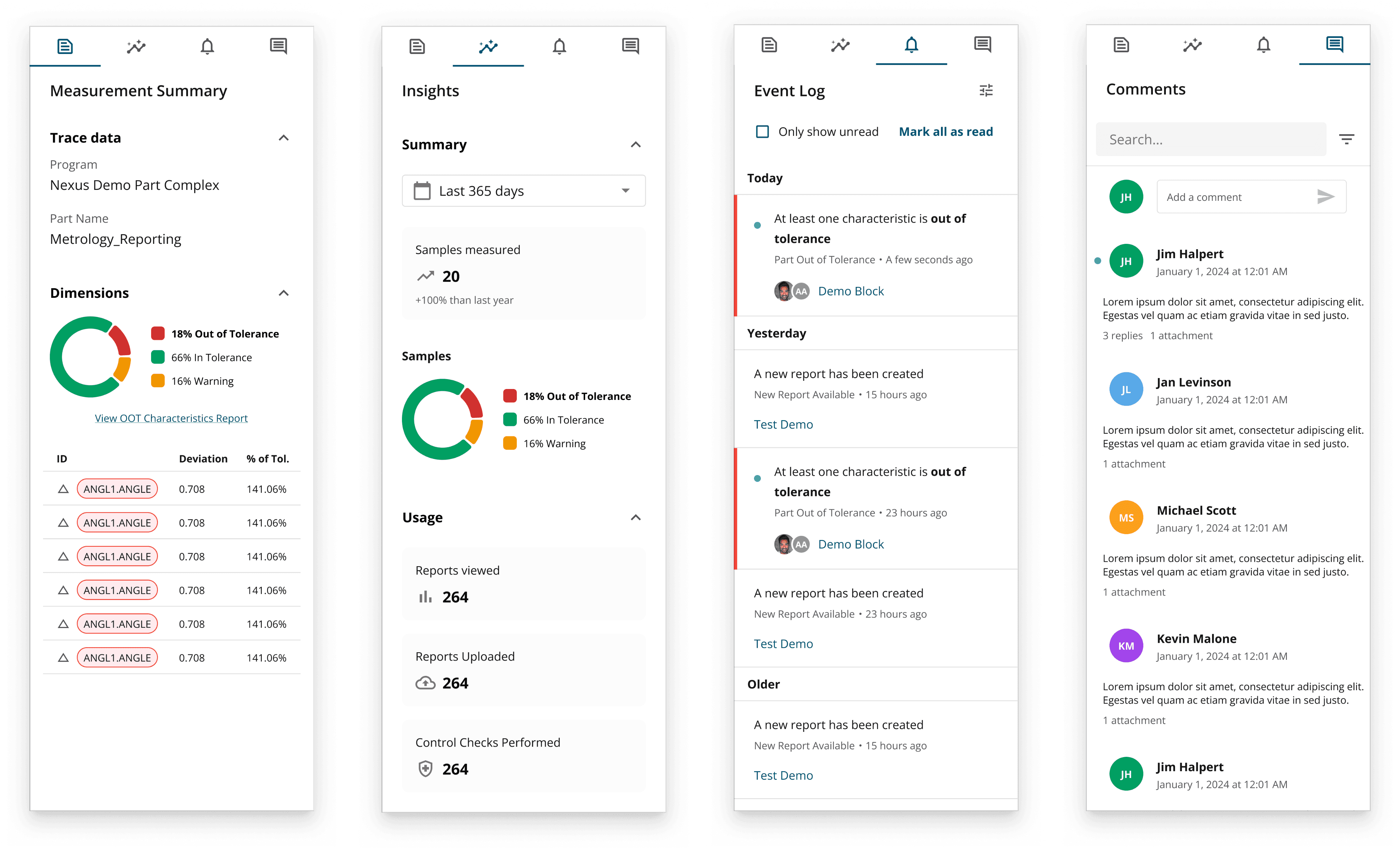
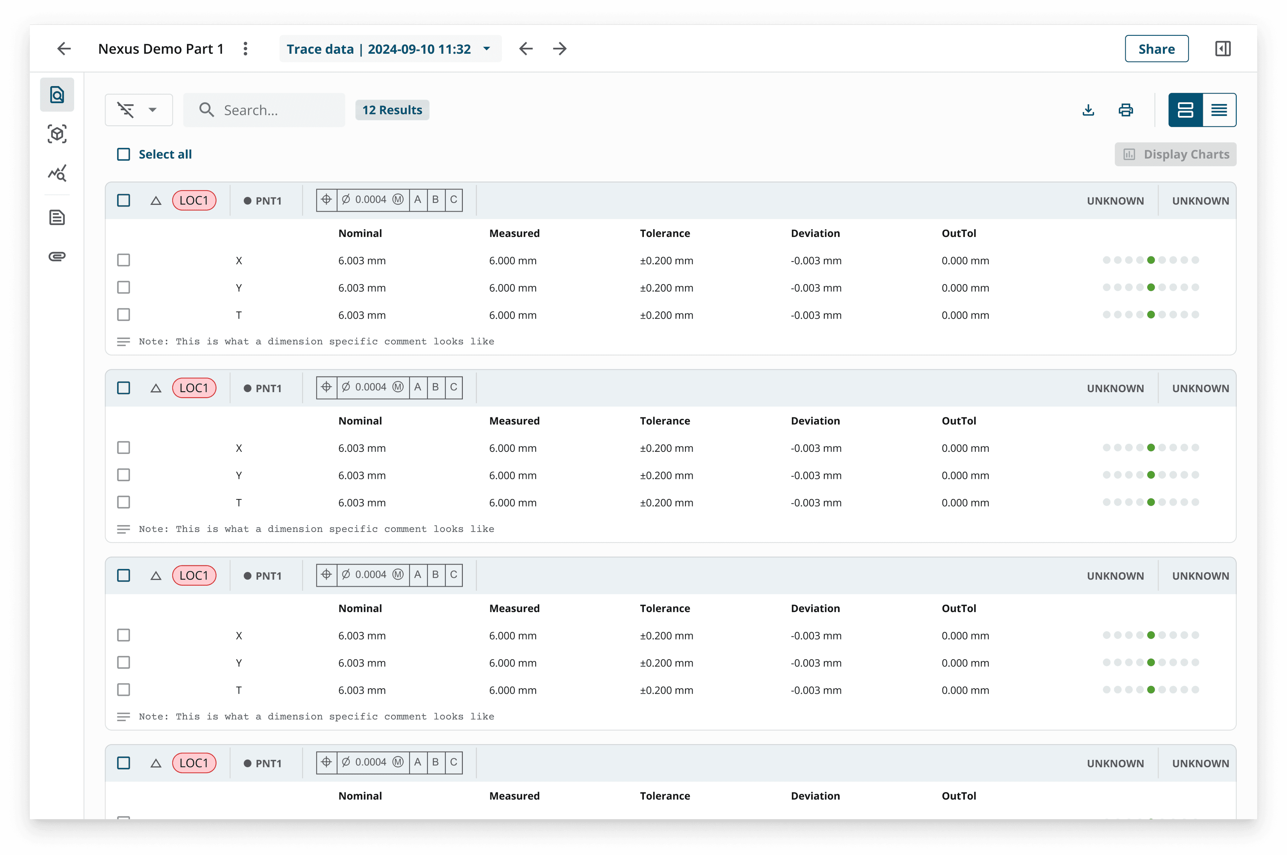
Reports are connected directly to live inspection data, and we introduced features like a contextual panel for traceability data, built-in analysis tools such as control charts, and even event logs with commenting, making collaboration part of the workflow rather than an afterthought.
The outcome
The new reporting experience lets teams view, explore, and share inspection results in real time from anywhere. Instead of scrolling through static tables, users see clear overlays of issues directly on the CAD model. When they need detail, they can switch to a fully customizable table to filter, sort, and format the data they care about. This makes reports easier to interpret for both experts and non-experts and helps reviews move faster.
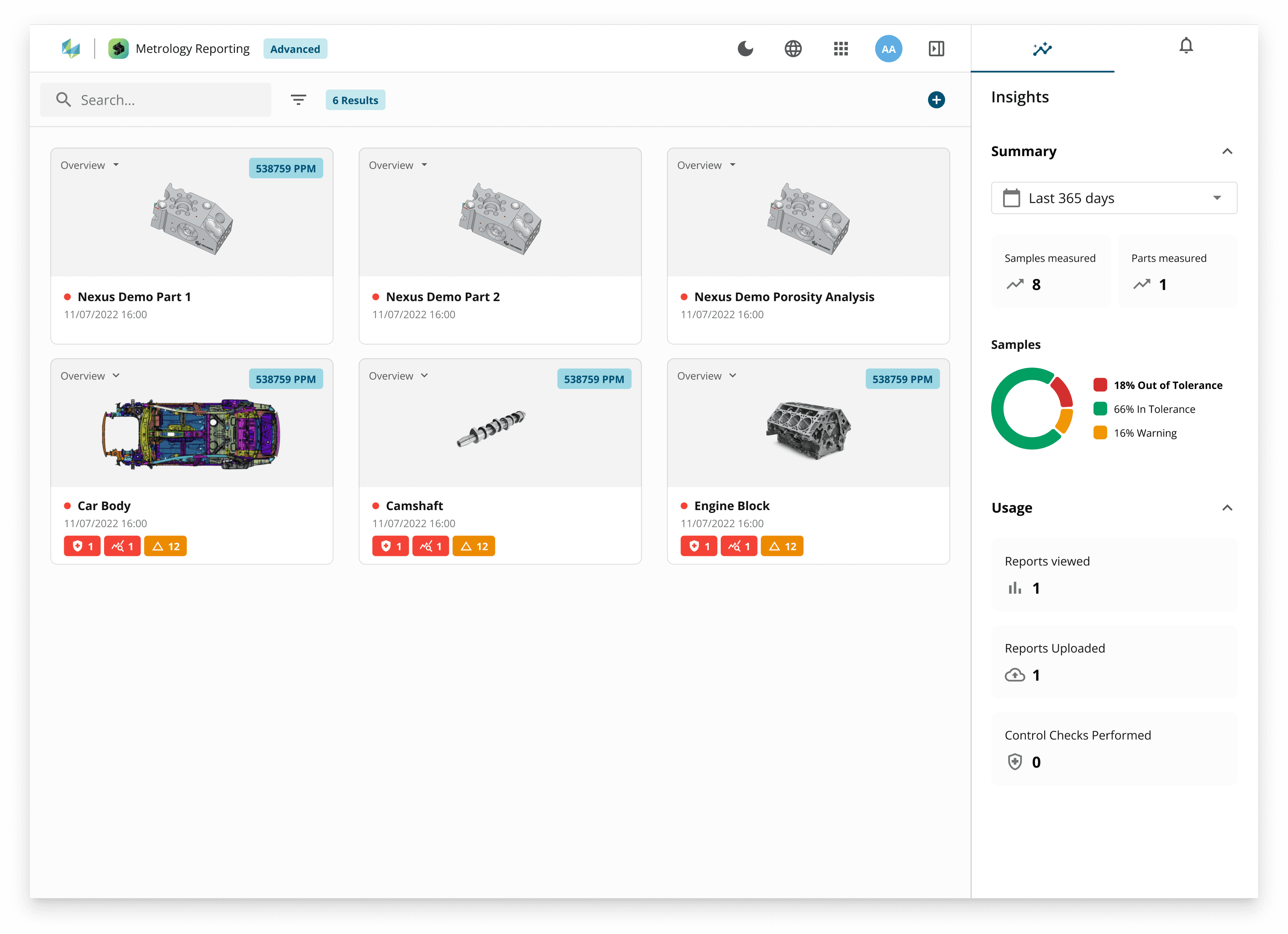
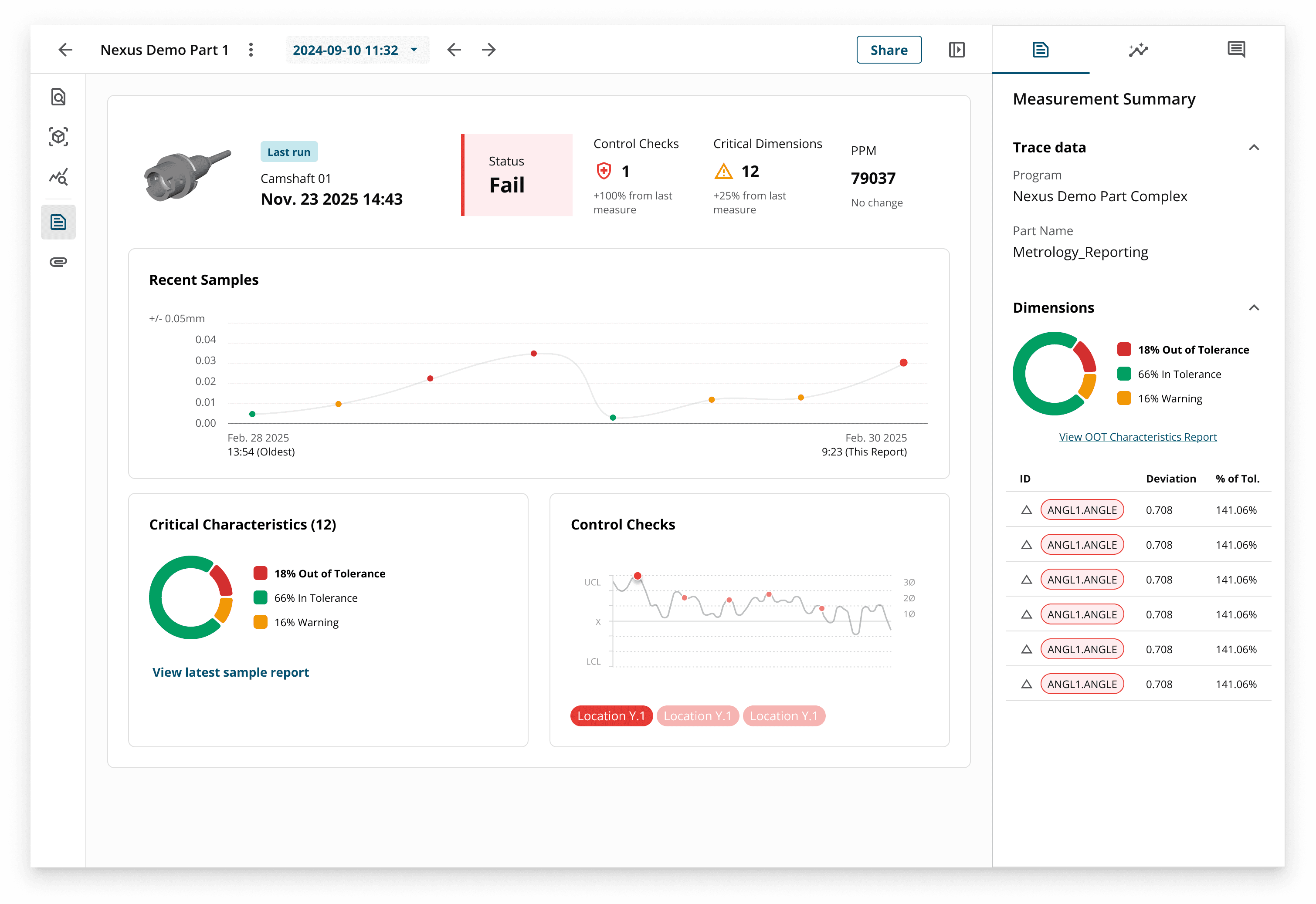
The part dashboard allows users to check the overall quality of their measured parts at a glance before diving deeper into individual reports.
The interactive Sample view allows users to select the types of charts they want to show for each line of the report.
Lessons learned
Good reporting isn’t only about showing data: it’s about giving people clarity and context when they need it most. This project reinforced the value of looking at the whole journey: where data comes from, who needs it, and how it drives action. By embedding collaboration and insight into the workflow, we helped shift reporting from a compliance requirement into a tool that actively supports better, faster decisions.
